INA'S
Brand Development and Graphic Design
INA’S is a new ice cream and dessert parlour located at Carob Tree Food Court in St. Julians, where desserts meet art to create something deliciously beautiful full of pure creativity.

Brand Development and Graphic Design
THE CHALLENGE
INA’S is a brand run by a family passionate about the Food and Beverage Industry. The ice cream and dessert parlour is inspired by their three wonderful daughters which must be represented within the brand together with the merging of ice cream and art. This was a particularly challenging branding exercise since the created brand had to please five different stakeholders within the business; the three daughters as well as the parents.
THE SOLUTION
INA’S came into being as the personification of three beautiful young girls; Martina, Korina, and Valentina which is where the name INA’S came to life. After a long conversation with the girls to understand their personality and their vision for the INA’S brand, we asked every girl to pick her favourite colour which will then be included in the brand to represent each INA; black, lime and turquoise.
Deliverables
- Brand Development
- Visual Identity
- Branding Guidelines
- Graphic Design
- Signage
- Ice Cream Cups
- Ice Cream Cones
LOGO EVOLUTION
The take-off point for the logo focused on art and paint, where the icon/colour pattern represented the mixture of the three INA’S, in order to produce something new, just like a painter mixes three separate colours to create a new colour. In this case, the colours were not completely blended in together to allow the individual INA’S to shine through in the mix. The lines within the icon represented the three INA’S weaving their ideas and passions together to create INA’S. It also represents the different fields of art coming together to create the brand; painting, drama, dance.
Although the logo was immediately loved by the three INA’S, after careful consideration, we decided to move on to a simpler logo, inspired by an art movement called Suprematism; an artistic movement that focuses on basic geometric forms, such as circles, squares, lines, and rectangles, painted in a limited range of colors. It is an abstract art based upon “the supremacy of pure artistic feeling” rather than on visual depiction of objects. The colours used within the logo represent each INA; black, lime and turquoise. Each different line and shape within the icon represent the three separate INA’S and how their ideas and passions come together to create INA’S. It also represents the different fields of art coming together to create the brand; painting, drama, dance. The white rectangle is left blank to allow the customer to associate themselves with the brand and figuratively ‘fill it with the colour that represents them’.


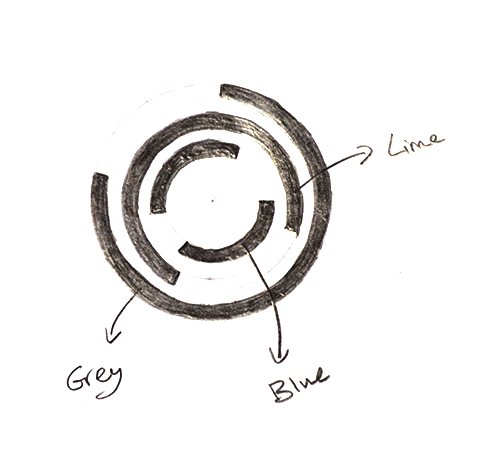
A new icon, also inspired by Suprematism was emerging through various sketches. The three circles within the icon represent each girl according to their age/colour, and the breaks in the circle and the fact that the three circles overlap to create a full circle show that they complete each other with their ideas. When the INA’S saw this logo, they fell in love, describing the icon as if the three sisters hugging in a circle. This was one of the proudest moments of my career as a graphic designer because they could identify themselves so clearly and passionately with the logo.
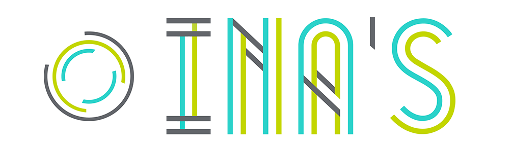
COLOUR PALETTE & FONTS

#C3D600

#2BD2CA

#63666B

[email protected] | +356 79961248
WEBSITE DESIGNED BY ELISACALLEJA.COM