EMILIA
Brand Development, Graphic Design and Website Design & Development
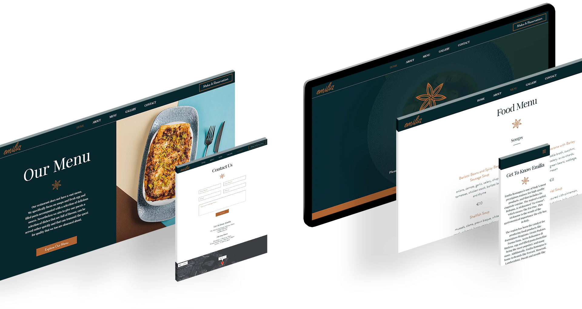
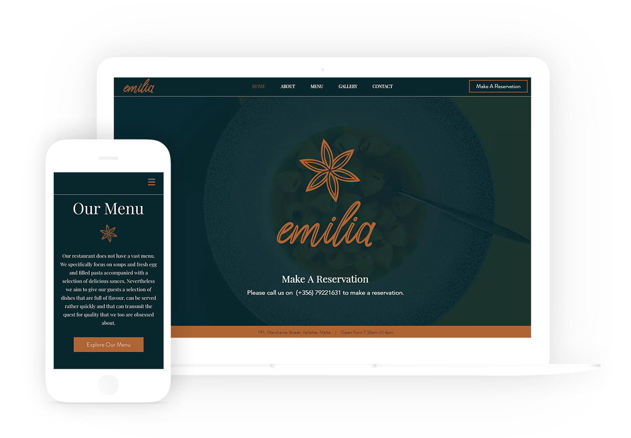
Emilia is a newly-opened restaurant at the boutique hotel Merchant Suites in the heart of Valletta, serving a small menu focusing on soups and fresh egg and filled pasta accompanied with a selection of delicious sauces.
Brand Development, Graphic Design and Website Design & Development
THE CHALLENGE
The owners of Emilia, who own several other Food and Beverage establishments around the Maltese Islands, aimed to create an establishment that serves a selection of dishes that are full of flavour, can be served rather quickly and that can transmit the quest for quality that they are obsessed about. The creation of the brand focused around this criteria and developed into Emilia.
THE SOLUTION
The restaurant, Emilia, is inspired by the region Emilia Romagna in Italy. Emilia Romagna is one of Italy’s most prestigious regions for high quality products, including its exquisite cuisine. The region’s capital, Bologna, is nicknamed “La Grassa”, which means The Fat One. This nickname is the result of the gastronomical importance the city has in Italy, making it the perfect inspiration for Emilia. The region has been the catalyst for producing food products like Parmigiano Reggiano, Grana Padano, Parma Ham, Aceto Balsamico di Modena, egg and filled pasta (tortellini being the most popular), and many more.
Deliverables
- Brand Development
- Visual Identity
- Branding Guidelines
- Graphic Design
- Menus
- Bill Holder
- Business Cards
- Comment Cards
- Signage
- Website Design & Development
- Mobile Responsive
- Reservations
- Search Engine Optimisation
LOGO EVOLUTION
After extensive research about the region, one aspect clearly stood out and become the inspiration for the Emilia icon; “Fiore
COLOUR PALETTE & FONTS

#06262B

#AE6431

#FFFFFF
FONT EVOLUTION

Aa
Playfair Display Regular 32pt
Playfair Display Regular 24pt
Playfair Display Regular 16pt
Vestibulum ante ipsum primis in faucibus orci luctus et ultrices posuere cubilia Curae; Donec velit neque, auctor sit amet aliquam vel, ullamcorper sit amet ligula. Cras ultricies ligula sed magna dictum porta. Mauris blandit aliquet elit, eget tincidunt nibh pulvinar a. Sed lectus nibh.
Aa
Avenir Light 32pt
Avenir Light 24pt
Avenir Light 16pt
Vestibulum ante ipsum primis in faucibus orci luctus et ultrices posuere cubilia Curae; Donec velit neque, auctor sit amet aliquam vel, ullamcorper sit amet ligula. Cras ultricies ligula sed magna dictum porta. Mauris blandit aliquet elit, eget tincidunt nibh pulvinar a. Sed lectus nibh.

[email protected] | +356 79961248
WEBSITE DESIGNED BY ELISACALLEJA.COM